

styled two ways : The Occasional chair edit from koala living
Exploring the adaptable beauty of the Koala Living Verage Occasional Chair
Some pieces of furniture are just enough to get the style of your space.
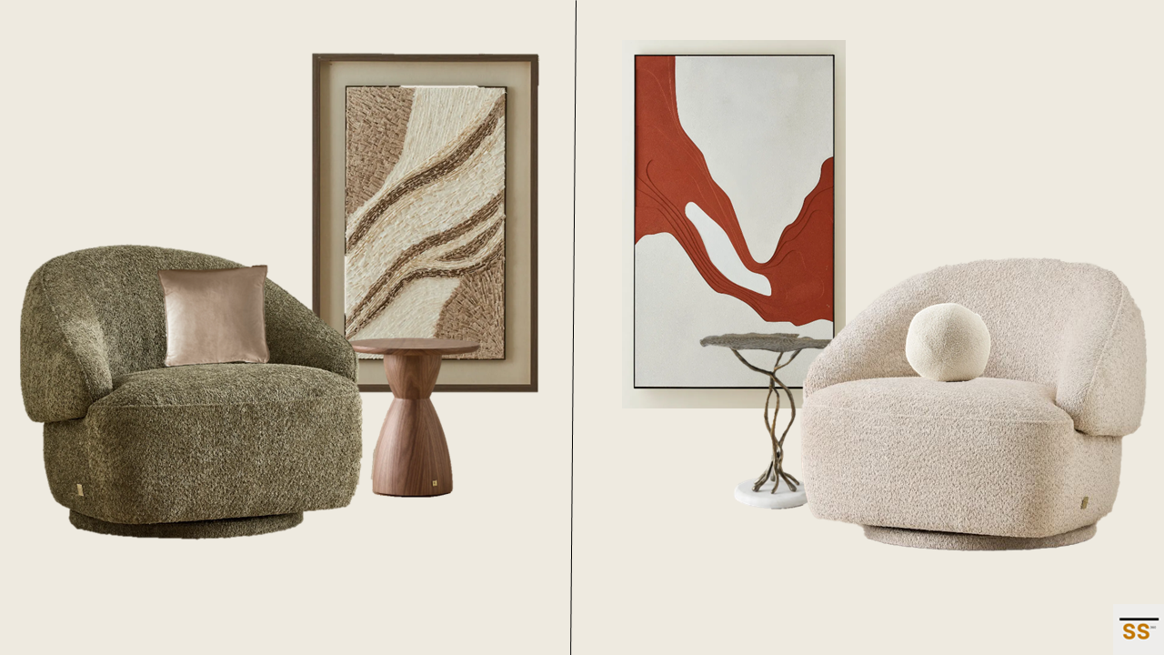
They don’t need excessive styling to command attention. Their strength lies in how effortlessly they adapt to the space. This week, we’re styling the sculptural Koala Living Verage Occasional Chair in two distinct interior moods, using color and texture as the design language.
At first glance, it’s the same chair. But the first, in a deep Winter Moss Green paired with warm wood tones, feels grounded, earthy, and richly textural. In contrast, the second, a soft Mid Beige, set against bold artwork or color-drenched walls, takes on a quiet, refined luxury.
The result? A styling study in contrast. And proof that good design doesn’t just fill a space, it transforms how you feel in it !
Why This Works
This styling approach shows the power of context and color. Both chairs feature the same form and texture, but the surroundings shift their expression dramatically.
Winter Moss Green: Earthy and deep, this color grounds the space. When paired with organic wood tones and tactile artwork, it creates a setting that feels rooted, warm and expressive.
Mid Beige: Light, luxe and elegant, this palette brings out the quiet sophistication of the chair. Set within a light filled room or beside bolder accents, it creates visual contrast while staying calm and modern.
Where You Can Use This Styling
The Verage Occasional Chair proves to be a perfect accent in a wide range of interiors. Here’s how you can adapt each version:
Winter Moss - Warm & Grounded Mood:
Ideal for cozy living rooms, study rooms or reading corners
Pair with mid-toned woods, art, and textural rugs
Add sculptural vases to complete the look
Mid Beige - Luxe & Airy Mood:
Best for contemporary homes, elegant living or formal sitting areas
Style with decorative side tables, and bold abstract art
Use layers of neutral textures (linen, ceramics, marble) for added interest
Interior Styling Takeaway: Contrast is Key
Contrast can be subtle, thoughtful, emotive and bold. Whether you lean into varying grounded tones or neutrals with hint of bold, the key lies in how color, texture and light come together to tell a story.
As we continue this Koala Living styling series, we’ll explore how other furniture pieces like consoles and sofas, shift their tone and feel across different spaces.
Want This Look?
We offer styling consults and moodboard creation for interiors across Melbourne, whether you're after one hero piece or a full room transformation.
DM us on Instagram @styledspaces360
Or head to our Contact Page to start your styling journey.
Subscribe to our blog for more style stories.
Shop the look - THE OCCASIONAL CHAIR EDIT FROM
Recreate the two distinct looks with these selections:
Furniture
Verage Winter Moss Occasional Chair – https://koalaliving.com.au/Verage-Winter-Moss-Woven-Fabric-Occasional-Chair
Verage Mid Beige Occasional Chair - https://koalaliving.com.au/Verage-Mid-Beige-Woven-Fabric-Occasional-Chair
Xavier Walnut Brown wooden side table - https://koalaliving.com.au/Xavier-Walnut-Brown-Wooden-Side-Table
Dhara Antique Brass finish leaf side table - https://koalaliving.com.au/Dhara-Antiqiue-Brass-Finish-Leaf-Side-Table
Soft Furnishings
Remi Beige velvet Cushion – https://koalaliving.com.au/Remi-Beige-Velvet-Cushion
Alora cream turrel fabric ball cushion – https://koalaliving.com.au/Alora-Cream-Turrel-Fabric-Ball-Cushion-31cm
Wall Art
Fita paper pulp Shadow box with light brown frame - https://koalaliving.com.au/Fita-Paper-Pulp-Shadow-Box-with-Light-Brown-Frame
Fluxion painting - https://koalaliving.com.au/Fluxion-Painting